
ReJuice
Mobile recipe app helping users create and enjoy delicious smoothies while mitigating food waste.
About ReJuice
Half of all fruits and vegetables purchased by Americans are thrown away. Nearly 150,000 tons of food is wasted every day in the United States. Fruits and vegetables account for 39%, an unfathomable 58.5 tons.
Studies conducted by researchers at the USDA’s Agricultural Research Service, the University of Vermont, and the University of New Hampshire have suggested that educating Americans about their eating habits and how to mitigate their food waste can go hand in hand. ReJuice encourages users to eat healthier while utilizing their excess fruits and vegetables.
Problem
The main focus was to provide an easily navigatable and intuitive user experience where users could easily locate and utilize the features they wanted without being distracted or overwhelmed by a confusing interface or too many features they weren’t interested in. The key problems that come from recipe applications as highlighted by users are:
1. There is an overwhelming amount of unwanted content, such as blogs and stories, that users have to sort through before they can access the recipe.
2. Recipes that are too complicated to follow with a complex and overwhelming number of ingredients.
3. It isn't easy to sort through and find what you want and can make with the ingredients you already have.
Solution
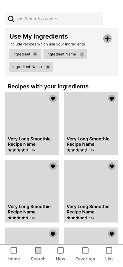
A comprehensive search function allows users to input the ingredients they already have and find recipes that use them, as well as a simplified process emphasizing ingredients, directions, and nutrition.
Software and Tools
Figma
InVision
Adobe Illustrator
Maze
UserTesting
InVision
Adobe Illustrator
Maze
UserTesting
Project Length
4 Months
Role
UX / UI Design
Brand Design
Brand Design
User Research
User research was used to explore different aspects of users, ranging from how they gather recipes, their current diets, and what they want from applications. This helps get a thorough understanding of who the users are, not just what they want.
Survey
The potential user survey aims to discover users' needs, frustrations, and motivations. The survey also provided useful information on the problems, how they should be solved, and if ReJuice was even needed or wanted by the respondents to solve this problem.
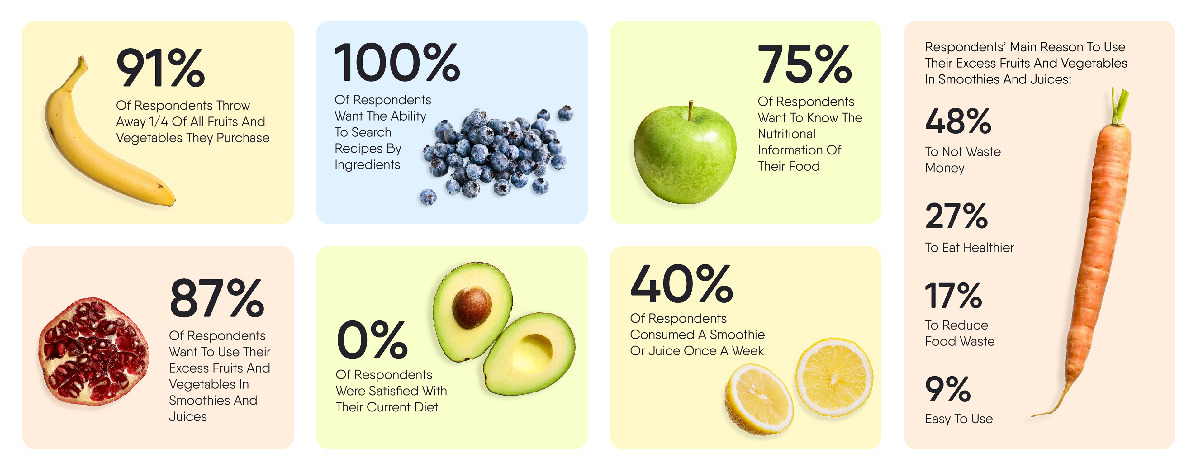
Survey Results and Analysis
Through the survey results and speaking with a few respondents of the survey, there are some clear needs and requests from the users. More users were interested in knowing the nutritional information of the smoothies and ingredients than I originally had expected. From this, it’s more apparent that the users place a high importance on health and nutrition.
When discussing with a couple of respondents, the key problems that they described with eating healthy were:
“I’m usually on the go and it’s easier to grab some leftovers or something quick than to prepare a healthy meal.”
“Healthy food is expensive and usually doesn’t last long in storage.”
Understanding these problems that users have with their current way of creating and consuming healthy foods is vital to explaining how using ReJuice will help them with these problems they find.
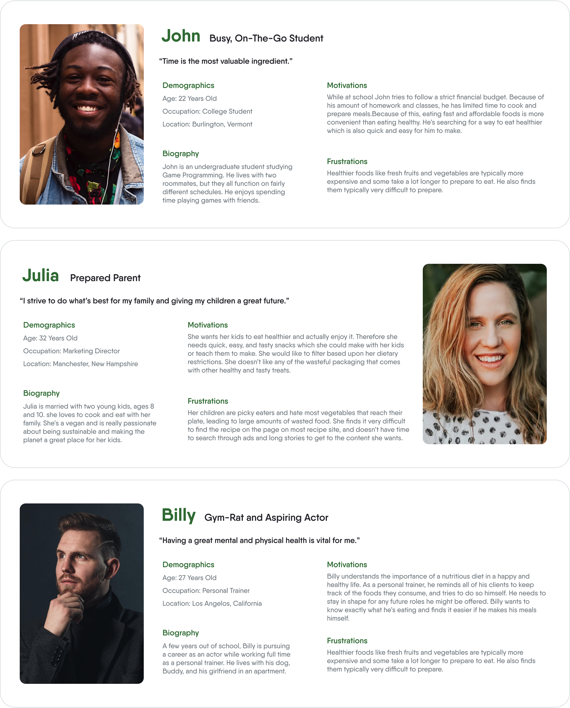
User Personas
From the survey and interviews, there were a few key user types that would utilize an app like ReJuice:
People looking to eat healthier but don’t have much time to focus on doing so.
People looking to be less wasteful and more sustainable with their food.
People who are health-focused care a lot about what is in their food.

User Stories
User stories and further understanding of users’ needs showed that both old and new users had similar needs. Each placed high importance on filtering ingredients and saving recipes, but less importance on uploading recipes.
Different user personas showed the distinction of needs based on their interests.
One user type was focused on utilizing their leftover food, inputting the ingredients that they already had, and finding recipes based upon that was much more important.
Another was more dedicated to knowing exactly what went into their food, thus finding the nutritional information of the smoothies and juices was at the top of their priorities.
For those in the middle of the two sides, they found that both of those things were semi-important, but wanted quick and easy ways to sort through recipes.
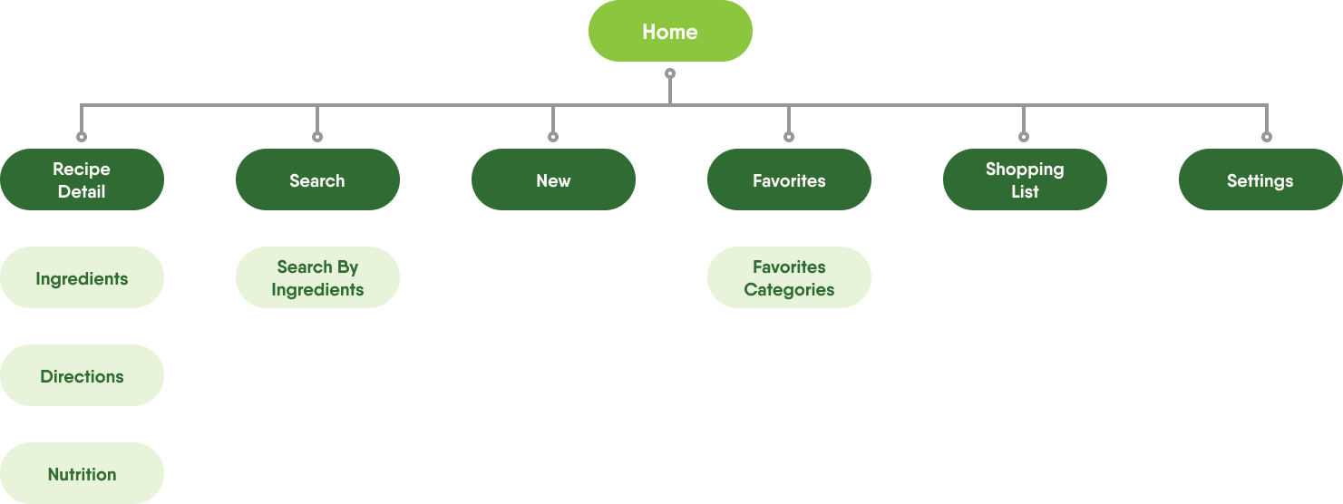
Site Map
The application is separated into sections and navigated from the home page based on user stories and needs.
In the Search page, users can search for specific results, and input all the ingredients they want to use.
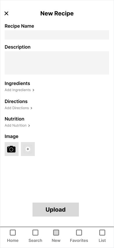
New allows users to upload their recipes.
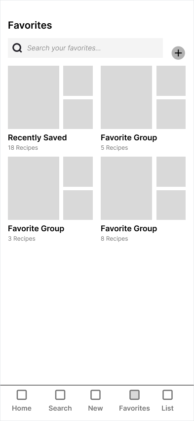
Favorites is where users can find all of their saved recipes. They can even categorize them based on their own needs.
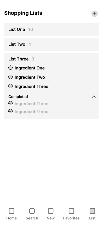
Shopping List, well, is a shopping list! Here users can create multiple lists and keep track of everything they need.
Settings allow users to create an account needed for uploading new recipes.
Low-Fidelity Wireframes
Initial low-fidelity wireframes were used to test user flows.
Home

Recipe Detail

Recipe Detail - Ingredient

Recipe Detail - Directions
Recipe Detail - Directions Expanded
Recipe Detail - Nutrition
Search

Search with Ingredients
Shopping List
New Recipe
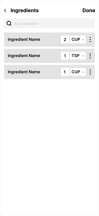
New Recipe - Add Ingredients
Favorites
Usability Tests
Throughout the testing process, users were asked to perform a few tasks:
Go to the pineapple banana oat smoothie page
Change the serving size to 3 people
Add strawberries to your shopping list
Go to the recipe for this smoothie and complete the first step
Go to your shopping list
Cross yogurt off of your shopping list
While performing usability tests and watching users walk through the app, it was clear which tasks and features of the app were intuitive for users, which took a second to realize what they had to do, and which tasks they had major problems with.
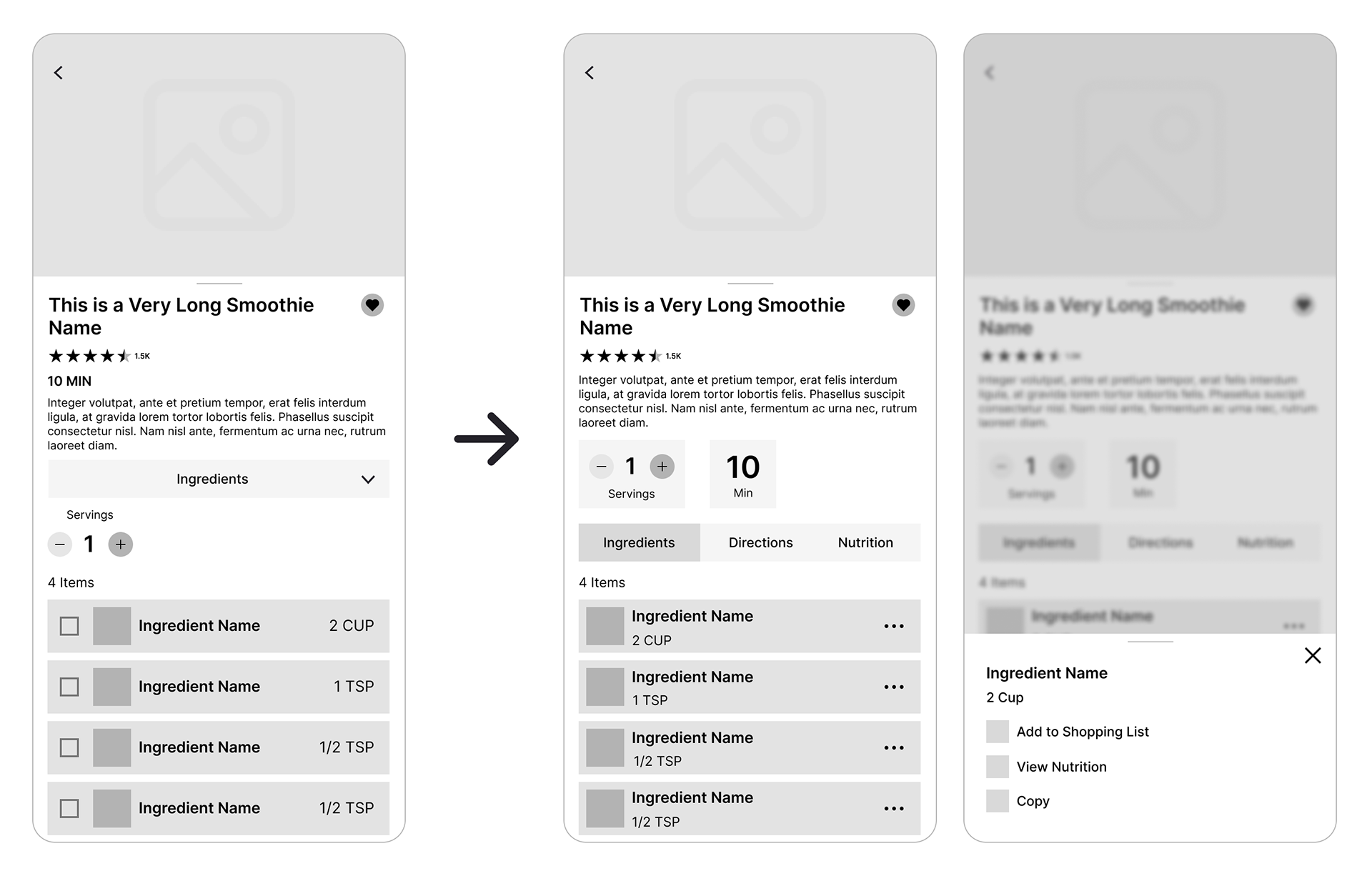
In the first usability test of the wireframe, the problem that came up, and then repeatedly came up throughout the following tests, was adding an ingredient to the user's shopping list.
This task held a very high misclick rate, with users clicking all over the screen trying to find ways to add the ingredient. It took users an average of twelve seconds before they were able to add the ingredient to their list. This is incredibly high and testers regularly expressed that they found this step very frustrating.
This issue was something that I continued to deal with throughout the following tests. Using feedback and recommendations from the testers, I eventually found solutions that involved following users' expectations as the basis.
Usability Tests Changes and Solutions
Recipe Detail Page Changes
After interviewing and testing with users, the first change was moving the serving size outside the ingredients tab. This way users can change the serving size no matter what tab they're in.
Following recommendations from user testers, a new "more" button was added which users can press to add ingredients to their list directly from the recipe.
Users also didn’t understand the point of "checking off" the ingredients, so that feature was cut.
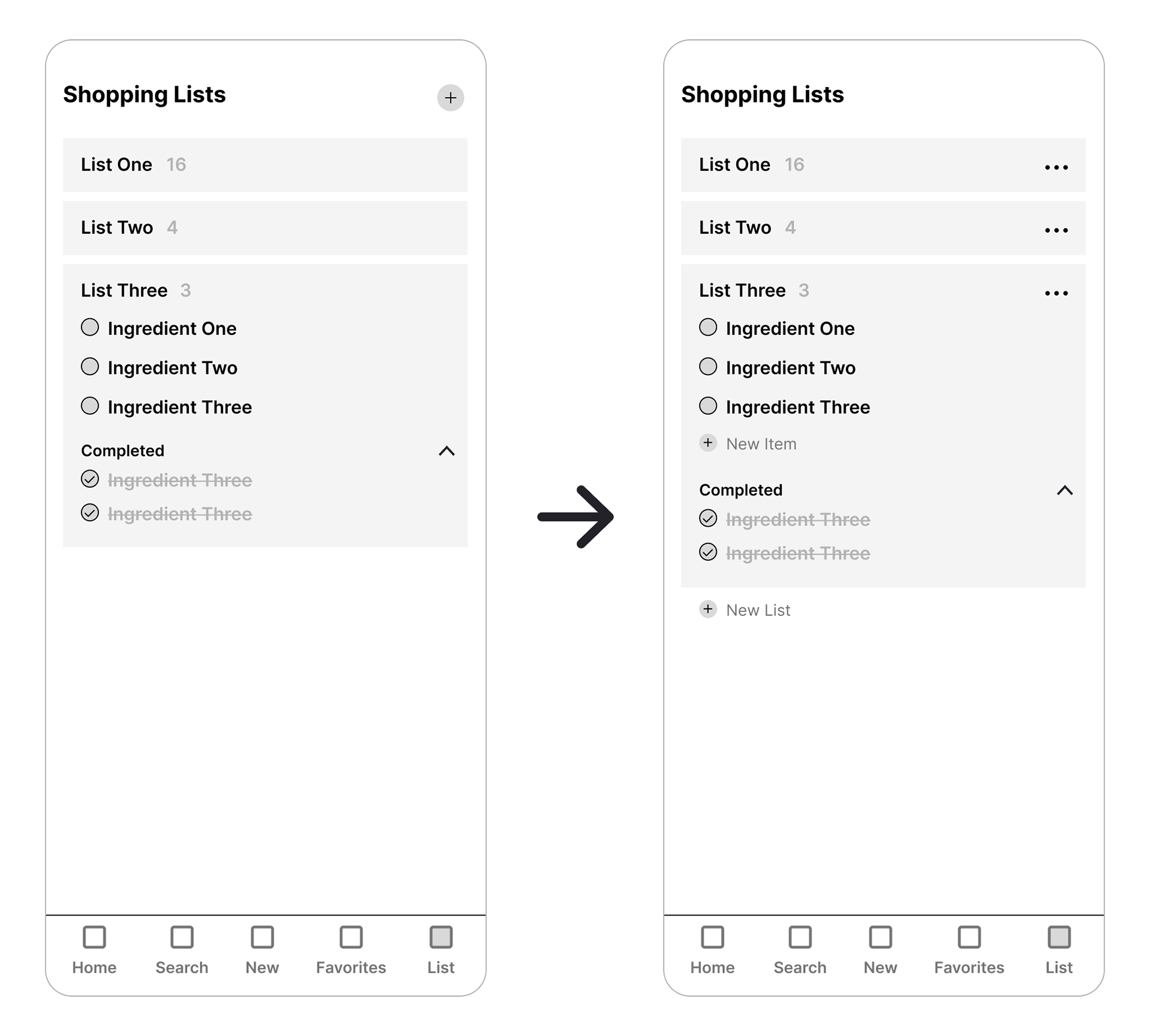
Shopping Lists Changes
Many users went to the shopping list and tried to add ingredients from there. While this seems like an obvious feature, it had completely slipped my mind as a possibility. This path was also added to the app. Having my users describe their expectations and thoughts while completing the tasks led to new solutions and concepts.
Preference Tests
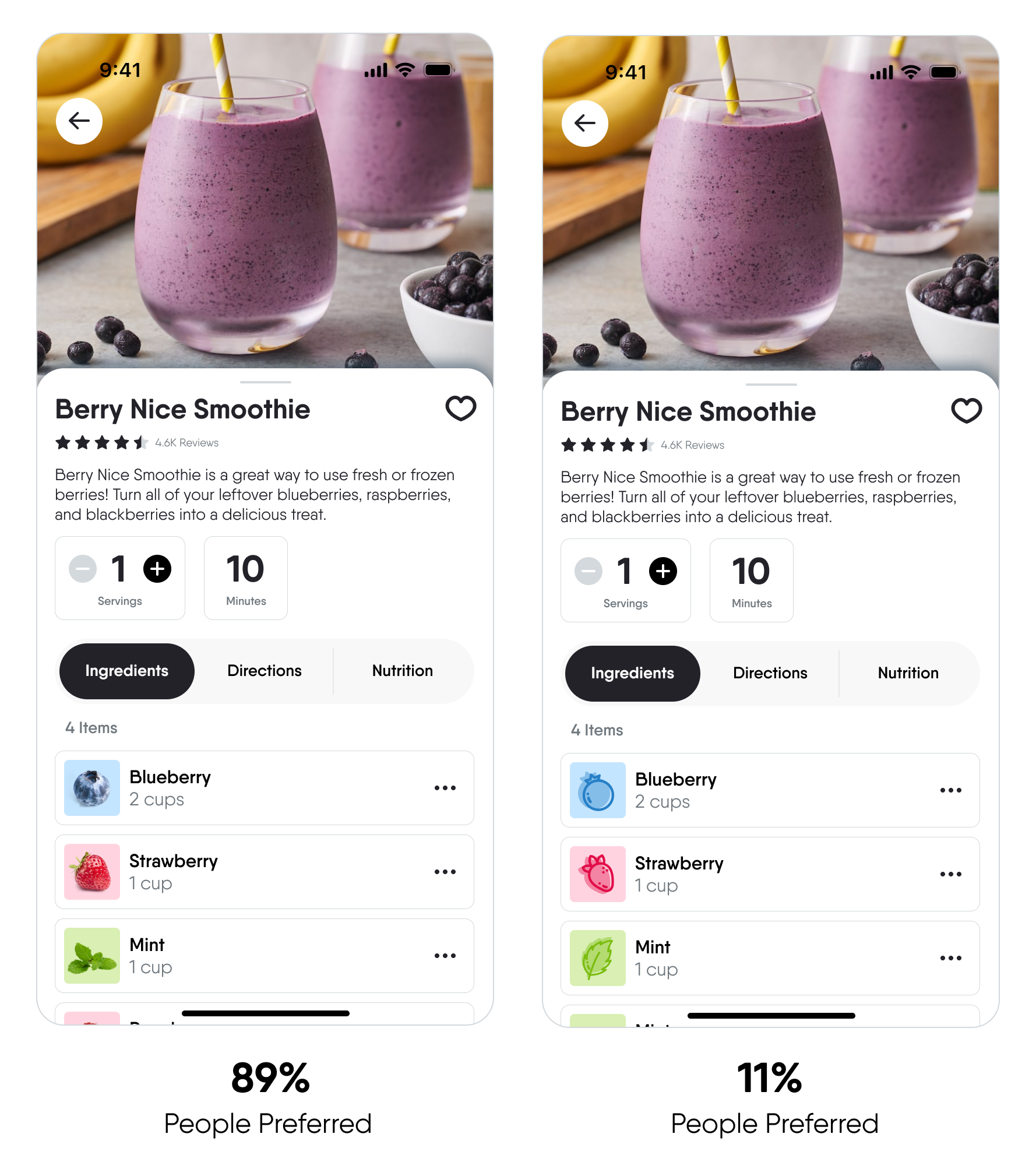
Ingredients Preference Test
The first preference test compared two different recipe detail pages. One page uses images of the ingredients while the other uses icons. The rest of the page uses just greyscale coloring of assets to not take away from the test.
Users preferred the pictures for a couple of reasons. The pictures were easily identifiable; users didn't second guess what that image was. Some users didn't understand what the icons were at first glance. Even stating that the blueberry icon looked like a bomb at first.
Users who chose the pictures also thought the icons looked a little jarring or out of place, while the pictures fit the feeling of the app.
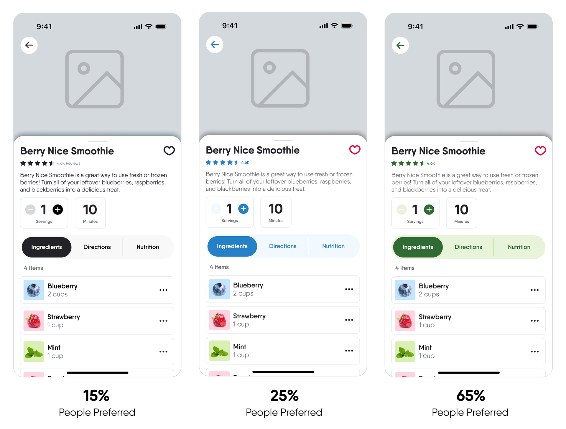
UI Colors Preference Test
This preference test compared three different recipe detail pages. Page A: greyscale, B: blue, and C: green. Testers were provided with the context of the app: a smoothie and juice recipe app used to mitigate food waste.
Testers preferred the green colors explaining that it felt more natural and connected to smoothies and juices. The green reminded them of reuse and composting too.
While they were also interested in the blue, some testers found it reminded them of the tech space at some levels. It was too similar to other applications that use that blue, such as Twitter and Google.


Brand and Design Guide
ReJuice uses a welcoming, friendly, and standout style throughout the brand. Based on the audience of a typically younger audience and the concept of fruits and vegetables, I created multiple color palettes that represented the colors that you’d see in your food. Utilizing preference testing, the color palette for the app UI and the brand.
The primary typeface, Qanelas Soft, uses rounded, open shapes in the letter forms to provide a welcoming, friendly feel. Qenalas Soft also has various weights, allowing for easy hierarchy application.
High-Fidelity Designs
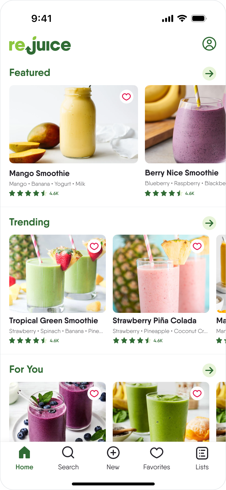
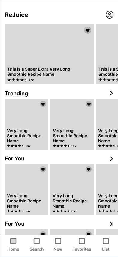
Home

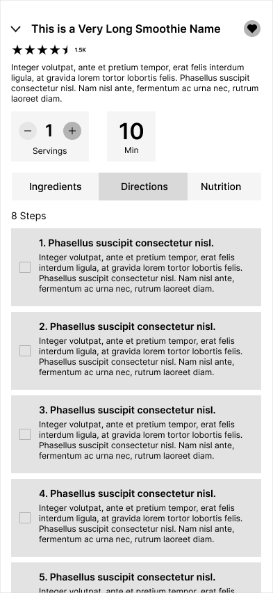
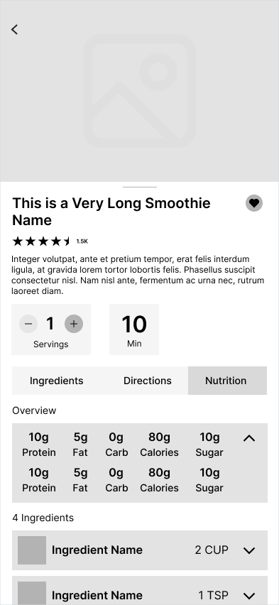
Recipe Detail
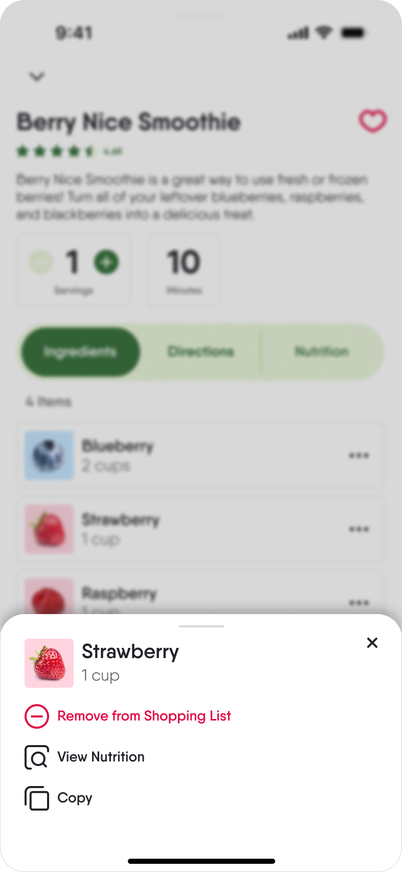
Recipe Detail - Add Ingredient
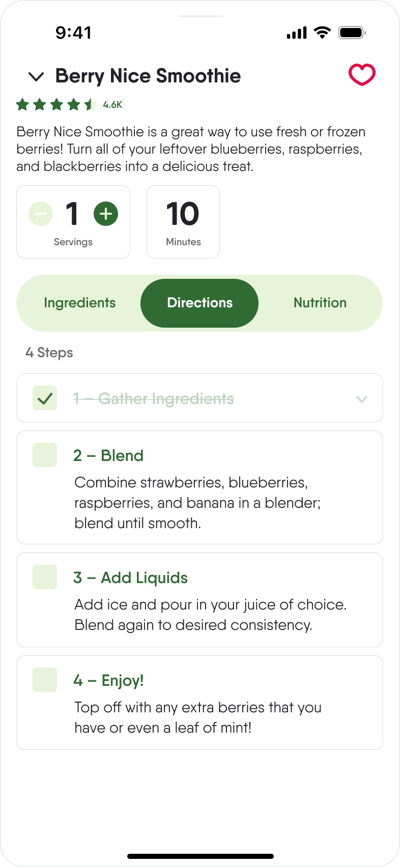
Recipe Detail - Directions

Search

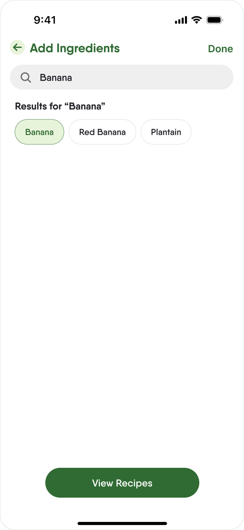
Search - Add Ingredients
Search Results
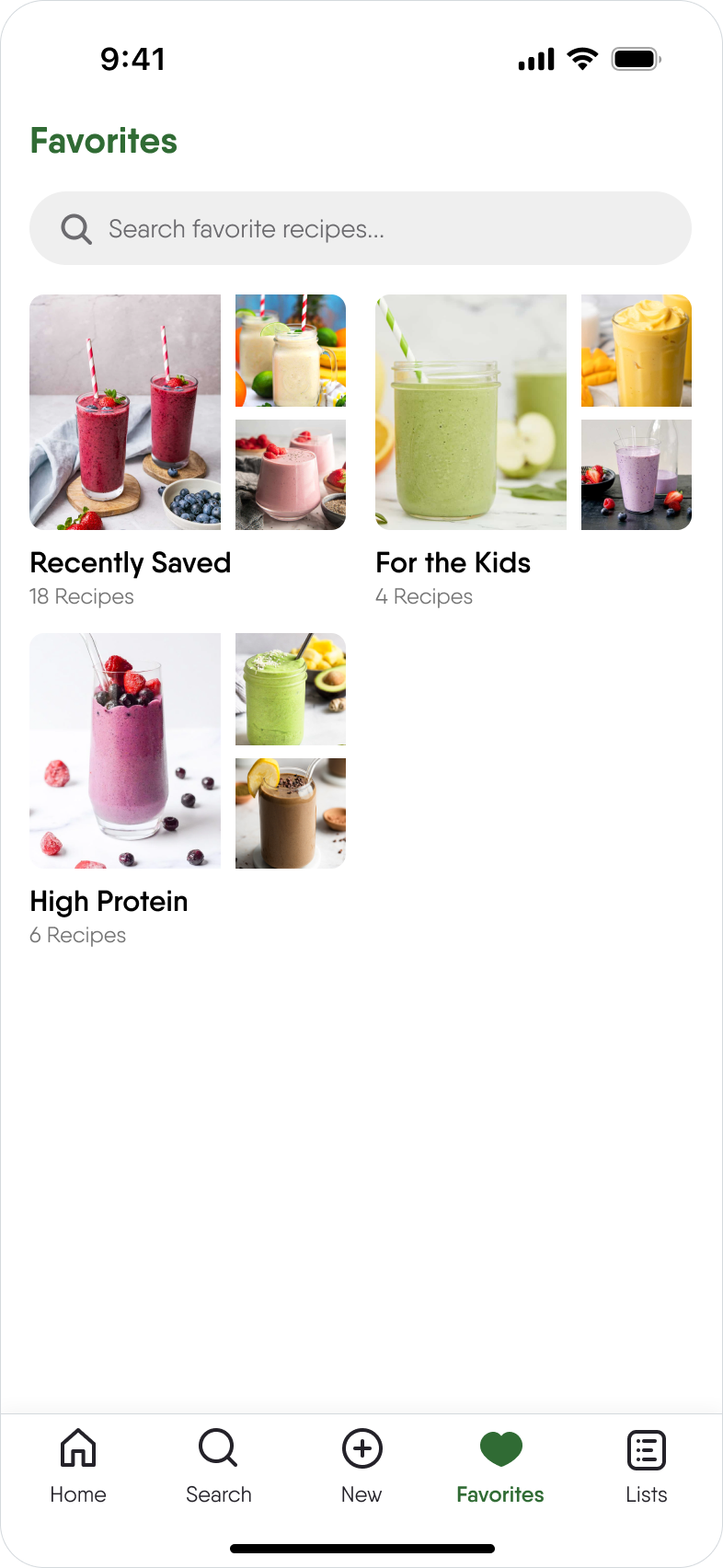
Favorites
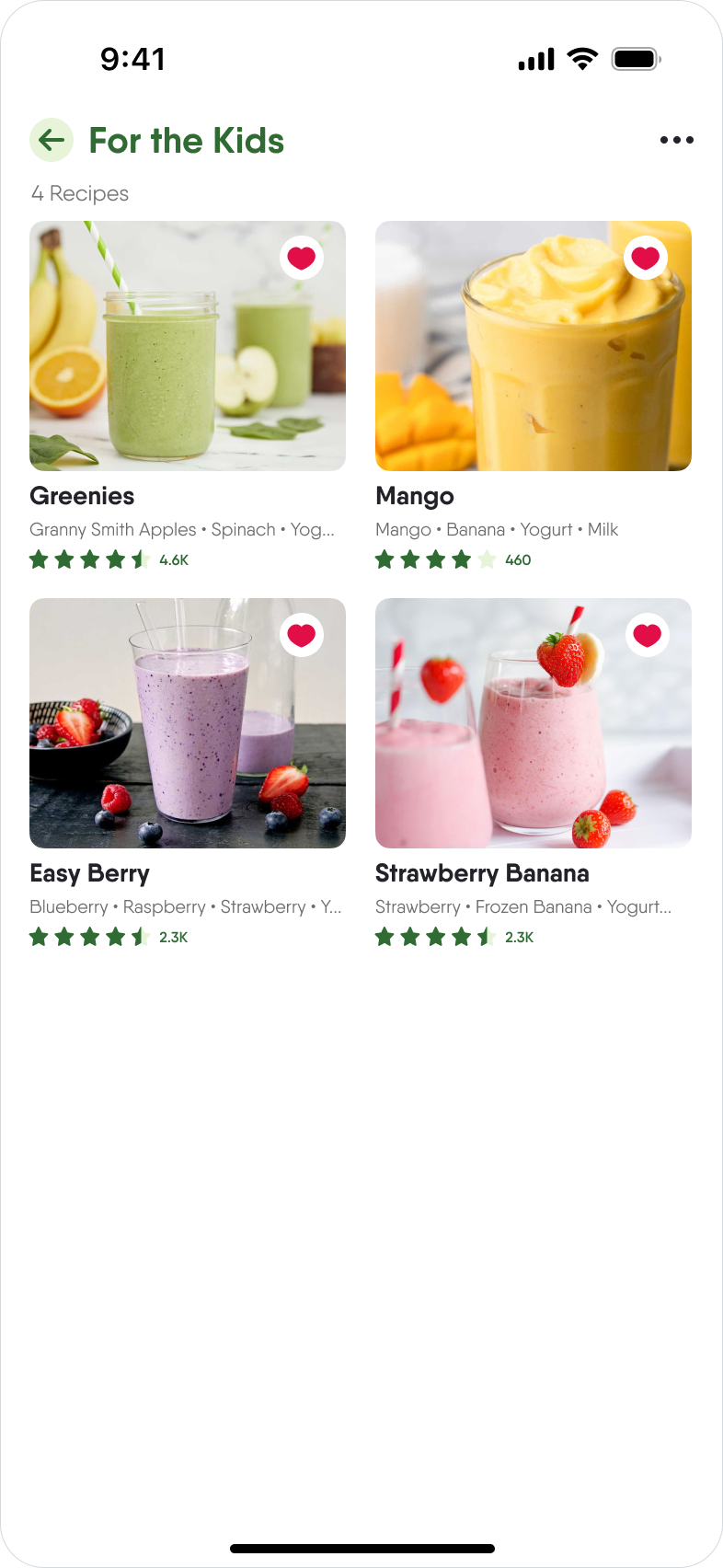
Favorites Detail
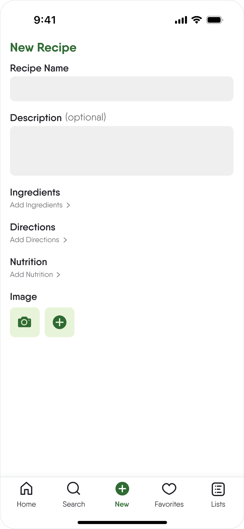
New Recipe

New Recipe - Add Ingredients

Shopping List
High-Fidelity Prototypes
Finding the Perfect Recipe
The process of searching for recipes using the user's entered ingredients.
Let's Make a Smoothie!
The prototype video showcases the user's process while navigating to and exploring a recipe detail page. This includes delving into the recipe, adding an ingredient to your shopping list, and checking off directions as they complete them.
Solution Outcomes
ReJuice achieved the following:
1. Created easy opportunities for users to eat healthier.
2. Emphasized different ways to use excess fruits and vegetables, helping mitigate food waste.
3. Simplified the user flow and reduced the extra content that recipe followers scroll through to get to the recipe.