Free Health Clinic
Responsive website for a non-profit clinic focused on providing easy-to-access care for uninsured and underinsured Vermonters.
About Free Health Clinic
Locally owned and operated, the clinic's main goal is to provide accessible health care to community members in need. Located in a neighborhood where a majority of residents are immigrant families, many residents are uninsured or underinsured.
Problem
The clinic needed a website that guides users through the entire process of getting care, from the initial understanding of services to finances through making an appointment and receiving care.
The main goals and objectives of this website were:
1. Provide easy access for new and returning patients who may be unfamiliar with the healthcare process
2. Gaining support through donations and volunteering
3. Emphasizing trust and reliability
The main goals and objectives of this website were:
1. Provide easy access for new and returning patients who may be unfamiliar with the healthcare process
2. Gaining support through donations and volunteering
3. Emphasizing trust and reliability
Solution
A guided healthcare experience for new and returning patients, with a thorough emphasis on the clinic's support, and reliability.
The free clinic highlights the personalized care that they provide.
The free clinic highlights the personalized care that they provide.
Software
Sketch
Adobe Illustrator
Adobe Photoshop
WordPress
Adobe Illustrator
Adobe Photoshop
WordPress
Project Length
6 Weeks
Role
UI / UX Design and Front End Development
Site Map
The site is broken down into an easily navigatable guide to getting care.
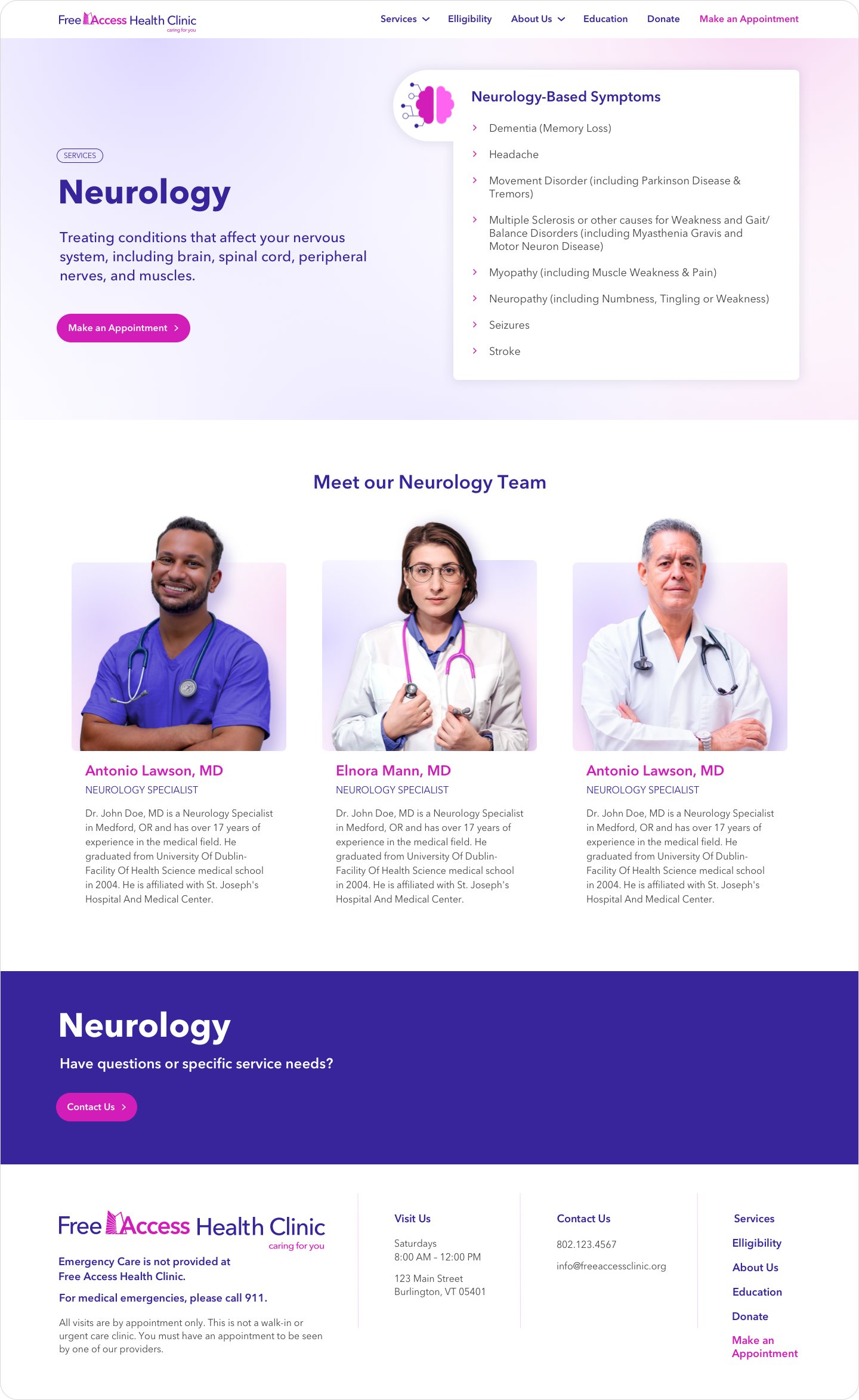
Pages for each service type allow a deeper exploration of each service, including the healthcare providers.
Understanding eligibility is important as the clinic only serves uninsured and under-insured people. This page guides potential patients into understanding if they're eligible for care.
Other vital pages such as donate and the make an appointment page also have a spot in the top-level navigation.
User Flow for New and Returning Patients
New users take a few steps before making an appointment and receiving care. First, they must decide if the clinic can help them by exploring services. Second, understand the eligibility guidelines. And finally, if the user is eligible, they can make an appointment through the new patient application.
Returning users have a much quicker path with the ability to go straight to the returning patient portal to follow up on their appointments or make a new one. Returning patients already understand what the clinic is capable of and their eligibility.
Because medical care and finances can be very complicated, the clinic encourages users to contact them at any point with questions during the process.
Image Selection and Treatment
The health clinic emphasizes the importance of providing healthcare for all people. Images were chosen to highlight people from all different backgrounds, similar to the clinic's clientele.
Representation creates a sense of belonging and encourages trust between the caregiver and the receiver.
Design Guide
The color selection creates multiple combinations that pass WCAG AAA guidelines. This allows for variations in design while maintaining an accessible experience for all users.
Iconography
Variety of iconography to help users understand the difficult medical vocabulary. This is especially important when many users speak English as a second or third language or don't speak English at all.
Responsive User Interface
A responsive site allows users to access their health program from any device. This is especially important for the clinic's patients who may not have computer access.


Guide to Getting Care
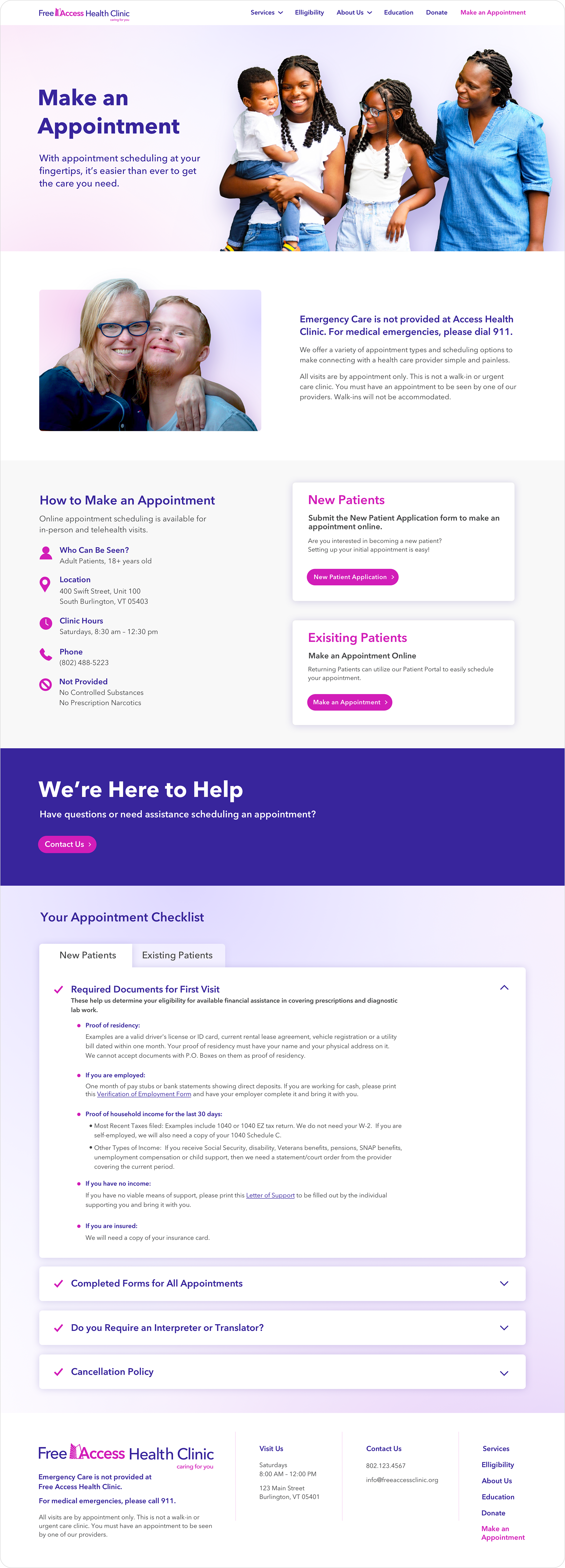
For first-time patients, making a doctor's appointment can be complicated. The clinic breaks down this process into easy-to-follow steps.
This includes the guide on determining your eligibility, receiving financial assistance, and finally how to make an appointment and receive care.
The user is also prompted with their appointment checklist which lists all required documents, forms, and policies they need to review and fill out before their appointment. All of this information in one place helps guide and support new patients.
Gathering Support
Because the clinic is run solely on donations, grants, and volunteers, gathering support is vital. The health clinic accepts donations in several forms, including online payment, by mail, or even corporate matching. The donation page also highlights non-monetary donations, like donating equipment and Vermont's vehicle donation program.
Including the donation form on the page keeps users on the site and encourages donations in multiple ways.
Solution Outcomes
The new website design achieved the following outcomes for the free clinic:
1. Created an easy-to-follow guide for new and returning patients to make appointments and receive care. This includes guides on understanding eligibility, financial assistance, and more.
2. Emphasized the clinic's reliability and ease of access which is vital for new patients.
3. Established ways to support the non-profit.
NEXT PROJECT
Responsive business-to-business website that emphasizes the manufacturer's quality, reliability, and expertise.
